
Visualizing Clustered Data in R
If you are performing unsupervised learning for exploratory data analysis, you’ll probably need to visualize the subgroups – or clusters – within the data. Color-coding the clusters is common, but here I’ll show you how to use the vegan package in R to make those clusters really stand out.
Full code is at the end of the post in case you want to skip the step-by-step tutorial.
Step 1: Load the vegan package
library(vegan)Step 2: Create example data with four clusters
set.seed(531) # set seed for reproducibility

df = data.frame(
  X1=rnorm(50, mean=0, sd=1), Y1=rnorm(50, mean=2, sd=1),
  X2=rnorm(50, mean=3, sd=1), Y2=rnorm(50, mean=0, sd=1),
  X3=rnorm(50, mean=6, sd=1), Y3=rnorm(50, mean=3, sd=1),
  X4=rnorm(50, mean=8, sd=2), Y4=rnorm(50, mean=-1, sd=1))

# reorder data for ordihull function
data = cbind(
  c(df$X1, df$X2, df$X3, df$X4),
  c(df$Y1, df$Y2, df$Y3, df$Y4))

# create data label variable for ordihull function
grouping = cbind(rep(1,50),rep(2,50),rep(3,50),rep(4,50))
Step 3: Initial plot of the data clusters (color-coded)
plot(df$X1, df$Y1, pch=20, col="cornflowerblue", xlim=c(-4,12), ylim=c(-4,5), xlab="", ylab="", xaxt='n', yaxt='n')
points(df$X2, df$Y2, pch=20, col="darkseagreen")
points(df$X3, df$Y3, pch=20, col="darkgoldenrod")
points(df$X4, df$Y4, pch=20, col="deeppink")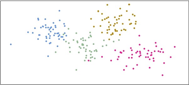
Step 4: Use ordihull function to make data clusters stand out
ordihull(data, groups=grouping, label=TRUE)
There are additional ordi plot functions that can achieve similar results, depending on your visualization needs and tastes. Here is an example with the ordispider function:
ordispider(data, groups=grouping, label=TRUE)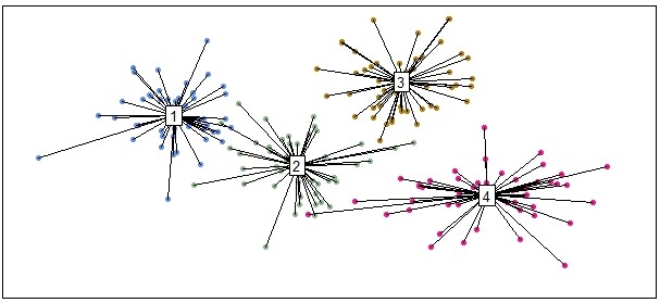
It’s worth giving the ordi functions in the vegan package a thorough look if you’re performing unsupervised learning and need to visualize data clusters. The help manual for the vegan package can be found here.
Full code
library(vegan) # load package

set.seed(531) # set seed for reproducibility

df = data.frame(
  X1=rnorm(50, mean=0, sd=1), Y1=rnorm(50, mean=2, sd=1),
  X2=rnorm(50, mean=3, sd=1), Y2=rnorm(50, mean=0, sd=1),
  X3=rnorm(50, mean=6, sd=1), Y3=rnorm(50, mean=3, sd=1),
  X4=rnorm(50, mean=8, sd=2), Y4=rnorm(50, mean=-1, sd=1))

# reorder data for ordihull function
data = cbind(
  c(df$X1, df$X2, df$X3, df$X4),
  c(df$Y1, df$Y2, df$Y3, df$Y4))

# create data label variable for ordihull function
grouping = cbind(rep(1,50),rep(2,50),rep(3,50),rep(4,50))

plot(df$X1, df$Y1, pch=20, col="cornflowerblue", xlim=c(-4,12), ylim=c(-4,5), xlab="", ylab="", xaxt='n', yaxt='n')
points(df$X2, df$Y2, pch=20, col="darkseagreen")
points(df$X3, df$Y3, pch=20, col="darkgoldenrod")
points(df$X4, df$Y4, pch=20, col="deeppink")

ordihull(data, groups=grouping, label=TRUE)
Did the ordihull function help you visualize your data clusters? What other function and packages do you use? Let me know in the comments below!
Check out more at ProjectsByPeter.com/Projects
Post content and images © 2021 ProjectsByPeter.com – All rights reserved.